 "ttyymmnn" (ttyymmnn)
05/13/2016 at 17:16 • Filed to: None
 20
20
 9
9
 "ttyymmnn" (ttyymmnn)
05/13/2016 at 17:16 • Filed to: None |  20 20
|  9 9 |

 BReLp7dzHM3ytYsE
> ttyymmnn
05/13/2016 at 17:21 |
|
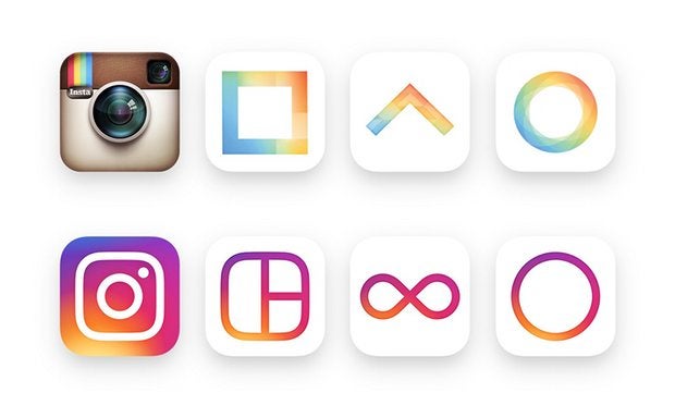
I honestly don't see why people are getting so worked up about it. It looks fine
 ttyymmnn
> BReLp7dzHM3ytYsE
05/13/2016 at 17:24 |
|
I don’t either, but I thought this was funny.
 BReLp7dzHM3ytYsE
> ttyymmnn
05/13/2016 at 17:25 |
|
Fair enough. It's a funny gif
 PowderHound
> BReLp7dzHM3ytYsE
05/13/2016 at 17:27 |
|
I wish the gradient wasn’t the background and was the stroke like their other uhmmm things. Other than that I don't mind it

 DynamicWeight
> BReLp7dzHM3ytYsE
05/13/2016 at 17:29 |
|
The instagram logo was classic. CLASSIC I TELL YOU! It was part of the cultural landscape. Now it looks dumb.
 Takuro Spirit
> BReLp7dzHM3ytYsE
05/13/2016 at 17:31 |
|
And here I am getting pissed because they keep moving my “Watch Later” playlist on my Xbox One YouTube app.
 BReLp7dzHM3ytYsE
> DynamicWeight
05/13/2016 at 17:33 |
|
I’m usually not a fan of change for the sake of change, but I’m totally fine with this. I like the look of the app itself better now actually
 Jcarr
> ttyymmnn
05/13/2016 at 17:37 |
|
Test
EDIT: Weird. I just commented on another Oppo post (non-shared) and I was in the gray.
EDIT2: Nevermind, it was a share.
So, Instagram logo, huh? Looks...colorful.
 Steve in Manhattan
> ttyymmnn
05/13/2016 at 19:08 |
|
The old one was fine - could spot it on my phone. Leave well enough alone.